
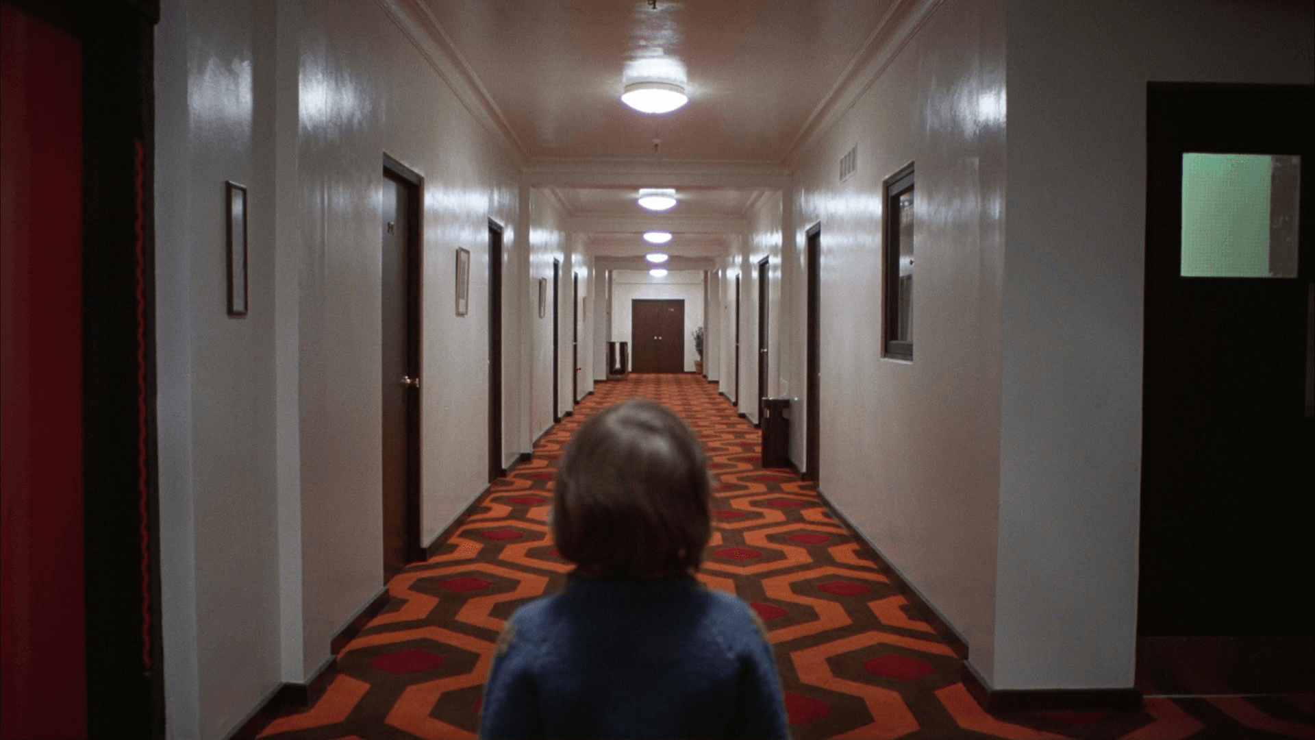
Every visual we create starts with the same question: how do we communicate a feeling, a story, an experience as clearly as possible? The answer almost always comes back to composition.
Composition is the arrangement of visual elements and the relationships between them. Light and shadow, color temperature, scale, focus. Understanding the governing rules, how to use them and when to break them, is what separates an image that is simply seen from one that is truly felt.
The Focal Point
Every strong image has a focal point. It tells the viewer's eye where to go and what matters. Most of the time this is the subject, but complexity arises when multiple subjects compete for attention. The goal is always clarity, directing the eye with intention rather than leaving it to wander. If there are too many points of interest, chances are the image deserves to be broken down into a sequence of more than one shot.
Lens and Perspective
Focal length shapes everything. Wide lenses around 20mm stretch the frame but open up the background, useful for establishing shots or tight spaces, think the corridor scenes in The Shining, where the wide glass exaggerates the depth of the Overlook's halls and makes them feel endless.
Medium lenses between 35mm and 65mm sit closest to natural human vision, the workhorse range for dialogue scenes and character drama, like most of No Country for Old Men, where the image stays neutral and lets the performances carry the tension.
Long lenses, 70mm and beyond, compress the frame, isolate the subject, and strip back the background to its essentials, like the finale of The Graduate, where Benjamin runs toward camera on a long lens and seems to make no progress at all, or the "Star Destroyer" shot in Star wars: the force awakens, where distant objects loom unnaturally large behind the foreground.
Lines, Space and Depth
Lines are one of the most powerful tools in a cinematic frame. Vertical lines suggest strength and speed. Horizontals create calm. Diagonals break balance. Curves feel organic and fluid. Equally important is the relationship between positive space and negative space. Negative space is the art of doing more with less. Separating foreground, midground and background into distinct layers then creates the illusion of a three-dimensional world.
Balance and the Rule of Thirds
Balance keeps the frame comfortable to read. Breaking it intentionally creates unease or tension. The rule of thirds - placing a face or object at one of the four grid intersections draws the eye there naturally. Great for establishing a well positioned focal point. It also naturally avoids static, dead-center framing: centered subjects can feel flat or overly formal (used deliberately in some cases, like Kubrick or Wes Anderson, but it's a choice, not a default).
Frame Within a Frame
Framing a subject within another element inside the shot, a window, a doorway, an archway, draws the eye straight to what matters and adds a layer of depth between the viewer and the subject. When used in reverse it can also trap or isolate a character within the frame, if that is the intent of the story.
Beyond the Rules
None of this is law. Focal length, framing, balance, they're tools to serve the story, not a checklist to tick off. The strongest images often come from breaking these rules deliberately: a dead-center subject, an unbalanced frame, a trapped character with no depth to escape into. But that kind of deliberate break only reads as intentional when the rule being broken is fully understood first. Mastering composition isn't about following a formula, it's about knowing the formula well enough to know exactly when to abandon it.